Our Kitchen Reno – Part 2 – Inspiration and Design Plan
Hi there! If you’re new here, we are renovating our 1910 house in Northern NJ little by little and this year we’re tackling two big renovations: the kitchen and a bathroom. When I am not sharing beautiful weddings, you can usually find me planning our next reno. We’re keeping its old house charm but adding function and style while sharing our journey along the way. Be sure to come back frequently for updates in the next several weeks! You can also follow the journey in my Insta Stories.
See Part 1 here of our kitchen reno
A lot has happened in the world since I posted part 1 of my kitchen renovation (see here updates in my stories as well)…shortly after posting my recap, everything was put on pause as quarantine took place, followed by inspections being indefinitely canceled and lastly contractors not being allowed to work in the meantime. That gave us plenty of time to regroup and look at certain details we weren’t sure of, which gave us clarity on the final kitchen vision.
With our kitchen renovation on a stop-and-go pattern for the past 5 months, progress has been sluggish but we’re finally ready to pick up where we left off and share our renovation experience.
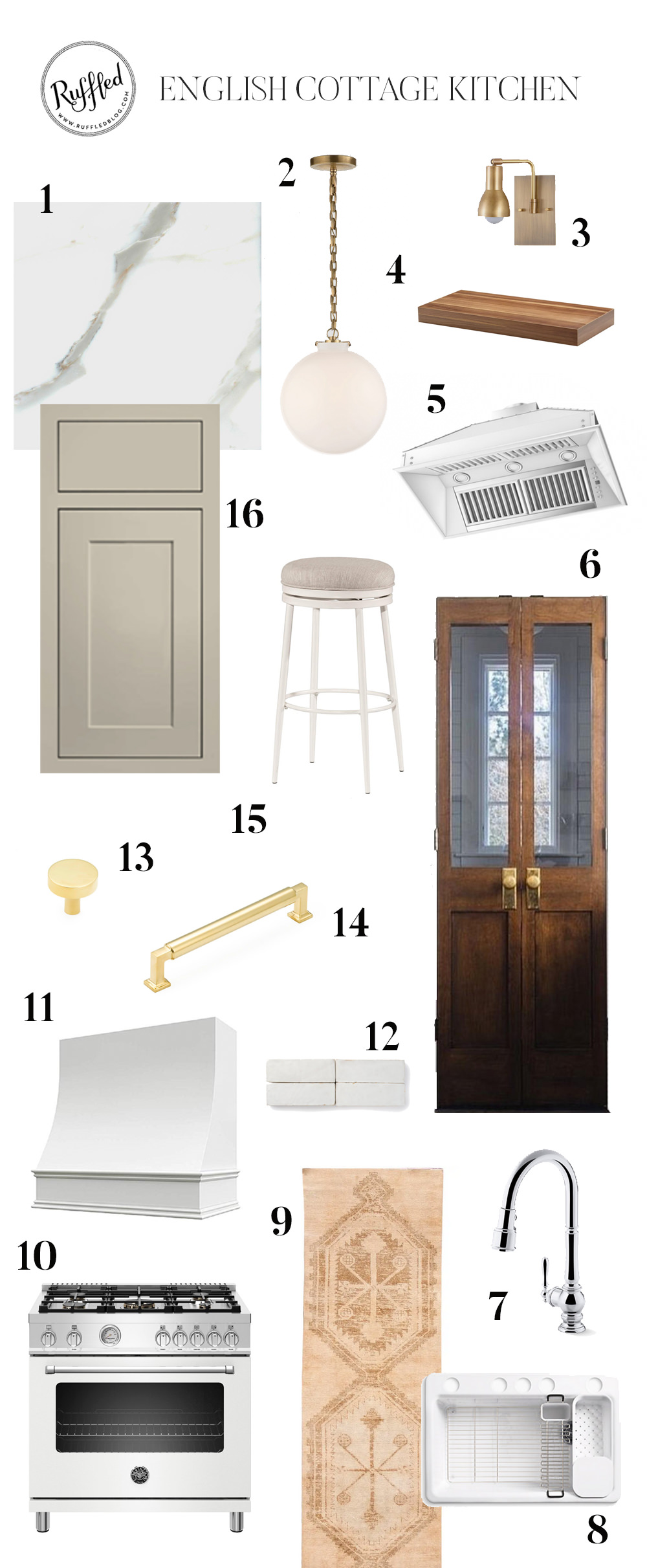
Moodboard: English Cottage Inspired Kitchen
It’s tough to put a title on our kitchen vision board, but I’d say it’s English-Cottage-meets-modern-French-Bistro. Greige kitchen cabinets with stone countertops with a mix of wood touches and black and white accents and brass hardware.

Moodboard resources:
1. Quartzite countertops, fabricator Artistic Stone
2. McGee and Co Katie Globe Pendant, white glass
3. Swing arm Brass Sconce
5. 34″ ZLINE 1200 CFM Ducted Insert Range Hood
6. Custom built glass french doors
7. Kohler Artifacts Pull Down Faucet
9. Vintage Turkish Oushak runner rug (similar rug from the shop I purchased)
10. 36” Bertazzoni range, white
11. CliqStudios Hood Cover in Cloud White
12. RiadTile 2×6 Zellige in Snow
13. Schaub and Company Haniburton Knobs in unlacquered brass
14. Schaub and Company Haniburton 6” Pulls in unlacquered brass
15. Upholstered white swivel stool
16. CliqStudios Kitchen cabinets in Austin (inset), color is Urban Stone
Design Plan
Our kitchen cabinet company, CliqStudios, was shut down soon after I posted part 1 of our kitchen reno back. It was heartbreaking and shocking to hear that the current environment imposed burdens that sadly made them close their doors. Michigan-based RTA company, Lily Ann Cabinets acquired the company and restored all accounts, so you can order from them as you could previously.
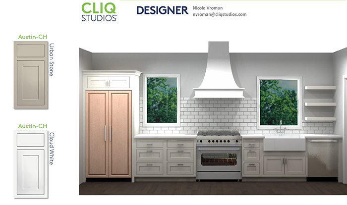
The mockups below were created by our kitchen designer, Nicole Vroman, who created a sketch based on my rough mockup and gave us ideas for a more polished layout. She designed the kitchen layout in a way that we could add a window on the left side of the range hood to create balance and symmetry.
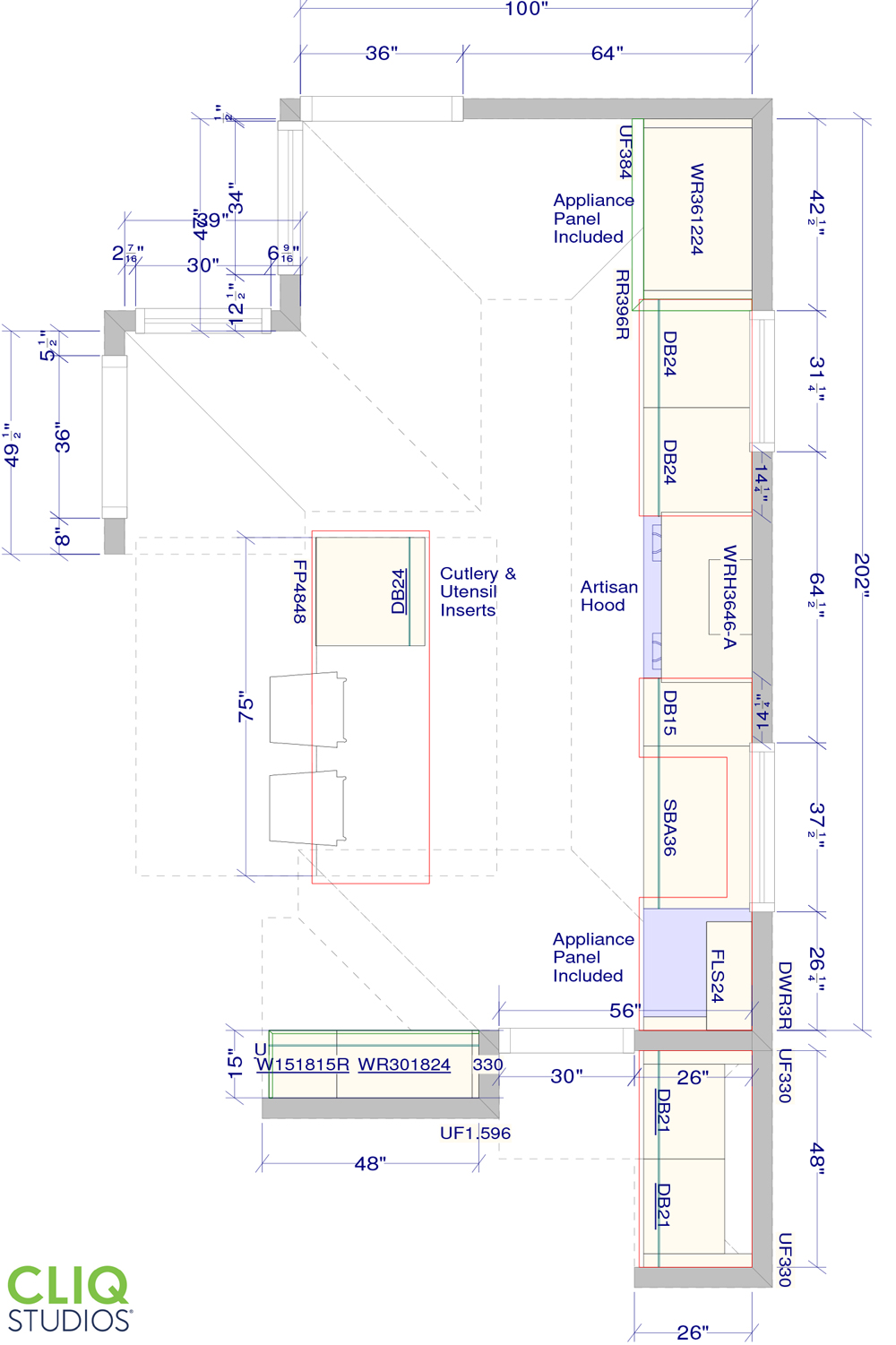
We were working with a mudroom addition to the back of the kitchen that was in progress, so getting specific measurements on the length of the side wall was not possible at the same time we were planning the kitchen. Usually, you need to measure once the space is drywalled, but because of the addition, we didn’t have the exact total length of the wall where the range would be. We gave about 3-4″ extra space and had the flexibility to build the wall next to the fridge a few inches out if needed, since nothing was framed out yet. This is also why you see the cabinetry ends “short” on top of the fridge in the mockups. The ceiling height directly above the fridge was also TBD on the blueprints of our addition, but the cabinetry above the fridge will go all the way up to the ceiling.

We needed more natural light in the kitchen, so we skipped uppers for another window (left side). We already had so much storage between a butler’s pantry, a walk in pantry and floor to ceiling cabinets that we didn’t worry about not having traditional upper cabinets. It also made the space visually lighter and airier without the uppers.
CliqStudios, also makes range hoods in a variety of styles and built to fit certain exhaust fan brands. We chose Cloud White (a soft warm white) for the range hood and Urban Stone for the cabinets in the Austin (inset) door front style. You can get free door samples if you’re not sure which one to choose – I was torn between Urban Stone and Harbor!

Our kitchen island, as suggested by the architect, would be 90″ by almost 36″ wide. That’s more than 2 feet longer and a foot wider than it should be for proper usage! You need at least 36″ between the stove and island and perimeter, and at least 48″ between the island seating and the wall behind it. Architects are not always kitchen designers, so this is another vote for working with a kitchen designer – they know kitchens and how they should function. I sent Nicole a rough mockup of what I was looking for and she created a design plan based on my original layout with her own improvements. CliqStudios will provide you with a free kitchen plan specific for your space.

CliqStudios‘s designer, Nicole, suggested a kitchen island measuring 75″x25″, with 24″ drawers on one side. That would give enough space for seating for 2-3 stools. Our kitchen is barely wider than 10 feet so that was really as big of a kitchen island as we could have without feeling cramped. We’ll build the kitchen island frame ourselves and the countertop fabricator will install the stone slab. CliqStudios also includes filler panels, touch up paint sticks, finished side panels and crown moldings to match the color of your cabinets.
We’re planning to add a stone apron for the kitchen sink, so we ordered a regular farmhouse sink base cabinet to cut the cabinet to size to fit the stone slab in front. I saw this inspiration image and thought it was the best of both worlds: you get the look of a stone sink, but the practical everyday use of an undermount sink without paying a hefty price tag and upkeep of a full stone farmhouse sink!

Building a Kitchen Island
We perused Erin’s kitchen island to create a plan for how to build our own. Since our kitchen island was much smaller, we didn’t need a steel frame. We instead used 3/4″ plywood and reinforced a frame for the peninsula to support the countertop and prevent the plywood from sagging using 3 rows of 2x4s. The entire kitchen island was then wrapped with finished 1×3″ with pocket screws.

We purchased the unfinished wood legs from this site and cut an indent at the top so the plywood top would sit flush on the legs. That way that the countertop could be placed on top concealing the plywood flush on the kitchen island. This also reinforced the legs while the 1×3″ wood keeps the legs from bowing out.


I always loved the look of zellige ever since we first visited Fes, Morocco back in 2010. I was debating on using the same countertop stone as the backsplash vs using tile all the way to the ceiling, but zellige tile at most places would cost almost just as much as using stone as the backplash at the usual 18″ height. Even though materials for the zellige prices I was looking at were less than the stone slab itself, the labor costs jumped over the edge for me. RiadTile sells zellige tile at an amazing value. They’re based out of Austin, TX, and carry handmade tile from Morocco. Their flat rate shipping is also a huge bonus when you’re ordering thousands of pounds of tile. I chose a 2×6 zellige in Snow and couldn’t be happier with the color and lucked out when it was back in stock. If you sign up for their notifications, you’ll be the first to know when it’s back in stock and ready to ship!


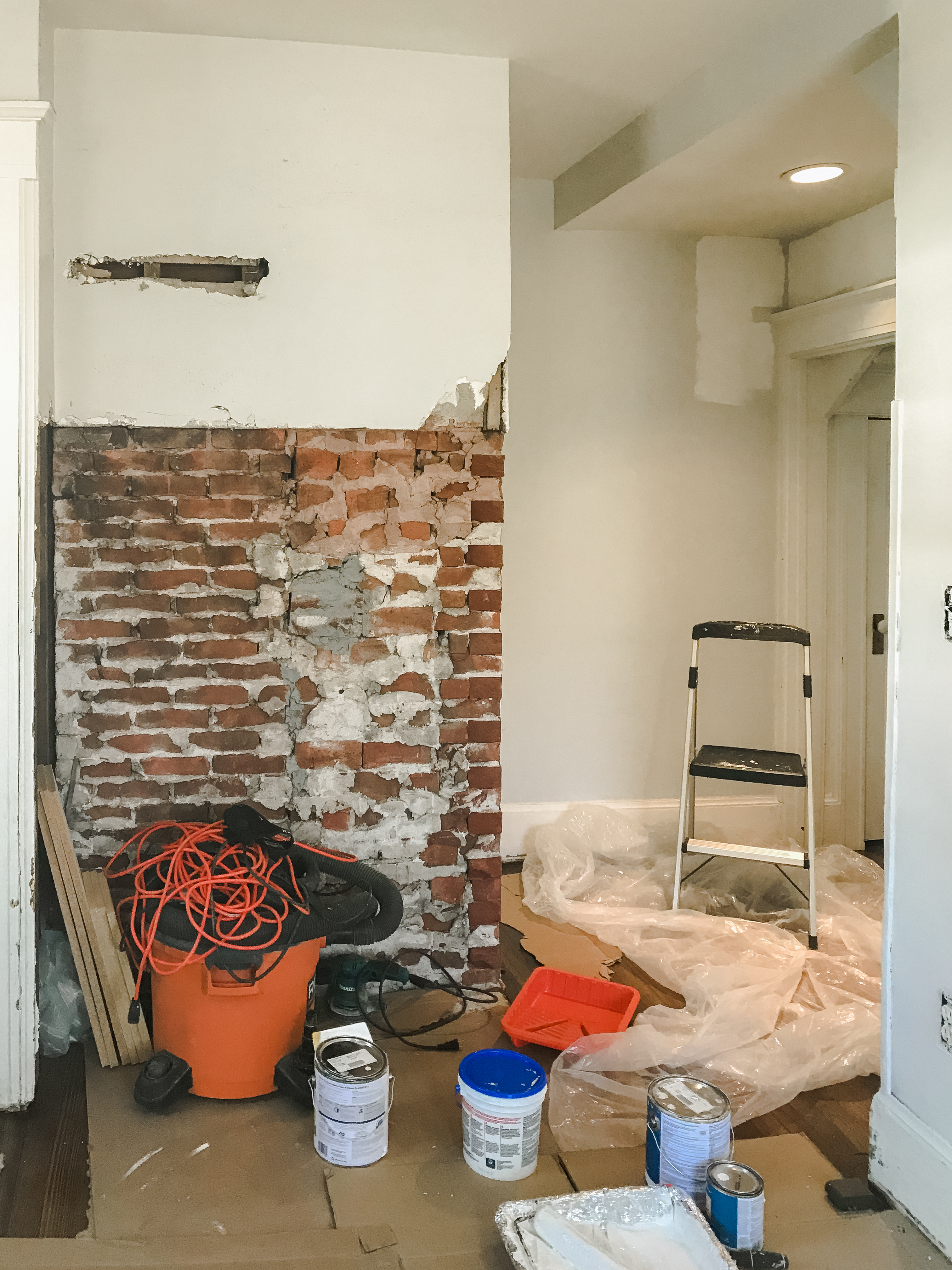
We’re turning our tiny half bath into a walk-in pantry. I ordered custom french doors from NorthernEdge Woodshop. They are handmade in Utah and ship free in the U.S. The solid wood doors add warmth to the space and break up the mostly greige room while helping us save a bit of space with a smaller footprint with the outswing of smaller doors. The glass panes help bounce the light around the room. We’re adding a suntunnel in the pantry which will make the doors stand out even more and add more natural light. Here’s the before of our soon-to-be pantry.
What’s next?
We’ll be sharing how we installed the sink, the apron front for the sink and how we decided on quartzite and some of the renovations bloopers we went through and how we fix them in a separate installment coming next week!

Dying to see the rest of the kitchen reveal!! Please don’t make us wait too much longer. 🙂 🙂